
October 2026 Reno-Sparks Market Update: Where Do Buyers Have Room to Negotiate?
If you are selling a Reno-Sparks home this fall, should you hold firm on price—or get more competitive? If you are buying, where might you have room to negotiate? September’s numbers tell two different stories depending on the price range, even as the overall median sales price remains higher than a year ago.
This is the October 2026 Reno-Sparks real estate update, using data through the end of September. The discussion below is a lightly edited transcript of Ryan Elliott’s video, adapted for clarity and organized alongside the original charts. Repeated phrases and filler have been removed. Written clarifications about mortgage payments, affordability, and listing-fee terms are labeled; the original video is unchanged.
Watch the October 2026 Reno-Sparks market update on YouTube.
What These Numbers Cover—and How to Read the Charts
Thanks for tuning in. Although this is the October update, all the numbers we are looking at run through the end of September, giving us a view of the market over the first nine months of 2026. Real estate is seasonal and cyclical. Comparing the same month from one year to the next helps separate normal seasonal patterns from changes in the market.
Unless a section specifically says otherwise, these statistics cover the Reno-Sparks metro area, including single-family homes, condos, and townhomes. The Reno-only and Sparks-only price charts below are different: those are single-family residential properties only.
On the historical charts, the yellow box at the top shows the primary statistic for September 2026. The comparison on the right shows September 2025, and the change is between them. The line charts generally look back about a decade. The price-range charts instead break down the September activity by price band. These are monthly comparisons—not nine-month cumulative totals.
If you find these updates helpful, please like the video and subscribe to the channel. Your support helps us bring this information to more people.
Mortgage Rates: A Major Influence on the Market
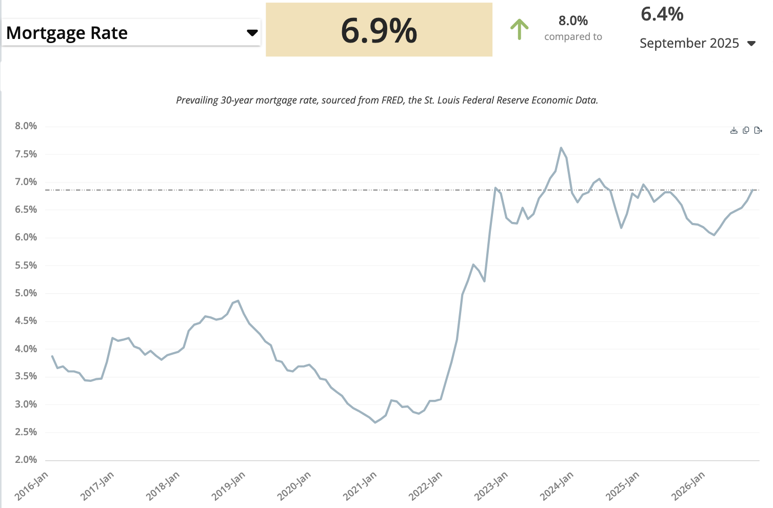
The first chart we look at is mortgage rates because they have such a large influence on the overall market. In the video, I estimate that roughly 80% of buyers use a mortgage, which is why rates matter so much for sales volume, prices, and what buyers can afford.
The supplied September chart shows a mortgage rate of 6.9%, compared with 6.4% at the same time last year. Rates get a lot of headlines, but around 7% is not unusual when you look beyond the exceptionally low-rate period.
My expectation in this update is that rates may stay somewhere between the mid-to-low sixes and the low sevens for the foreseeable future. That is an outlook, not a guarantee or a current loan quote. For anyone making a move, the payment available to you matters more than waiting for a particular headline rate.
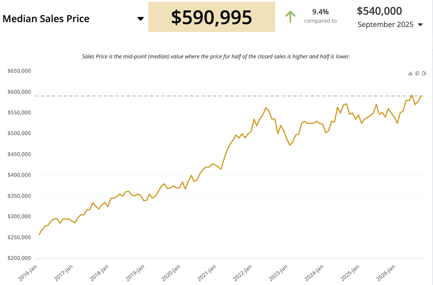
Overall Reno-Sparks Median Sales Price: $590,995
Median sales price tends to get the most coverage, so let’s look at a few different versions rather than treating the whole market as one number.
First is the combined Reno-Sparks metro figure for houses, townhomes, and condos: $590,995. That is up 9.4% from $540,000 in September 2025.
As interest rates rose, they began putting pressure on prices. Looking at the chart’s more recent pattern, I see a sideways channel rather than the steep climb of earlier years. That observation can coexist with a year-over-year increase; the comparison period matters. A median describes the midpoint of the homes that sold, not the change in value of every individual home.
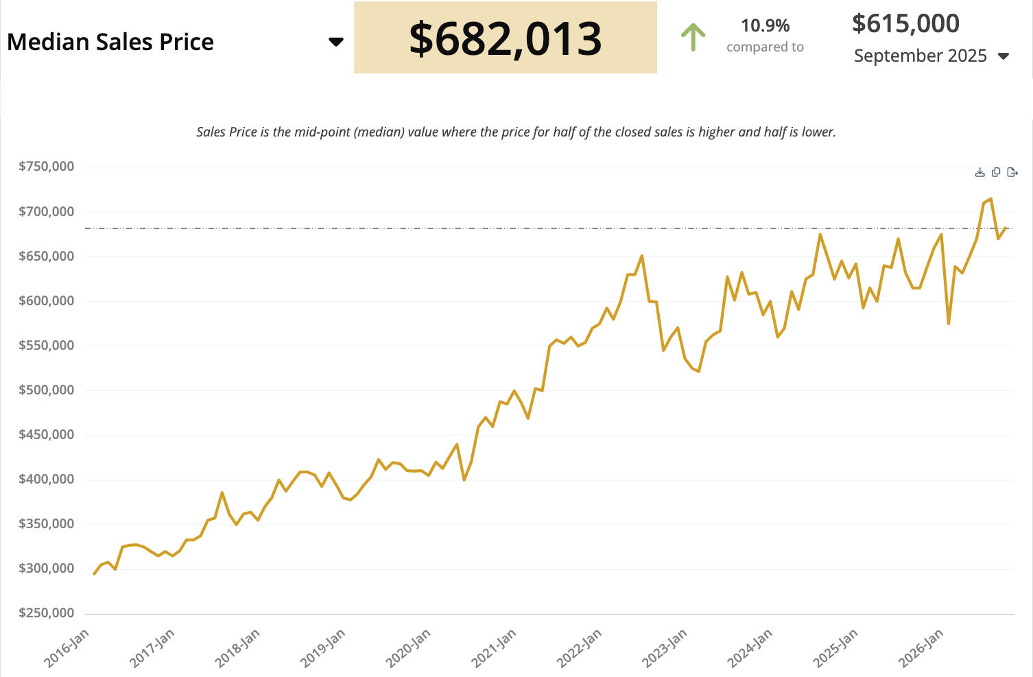
Reno Single-Family Homes: A $682,013 Median
Now narrow the view to single-family homes in Reno—no townhomes or condos. That median is $682,013, up 10.9% from $615,000 at the same time last year.
This is a city-specific, property-type-specific number. It should not be substituted for the broader Reno-Sparks median above.
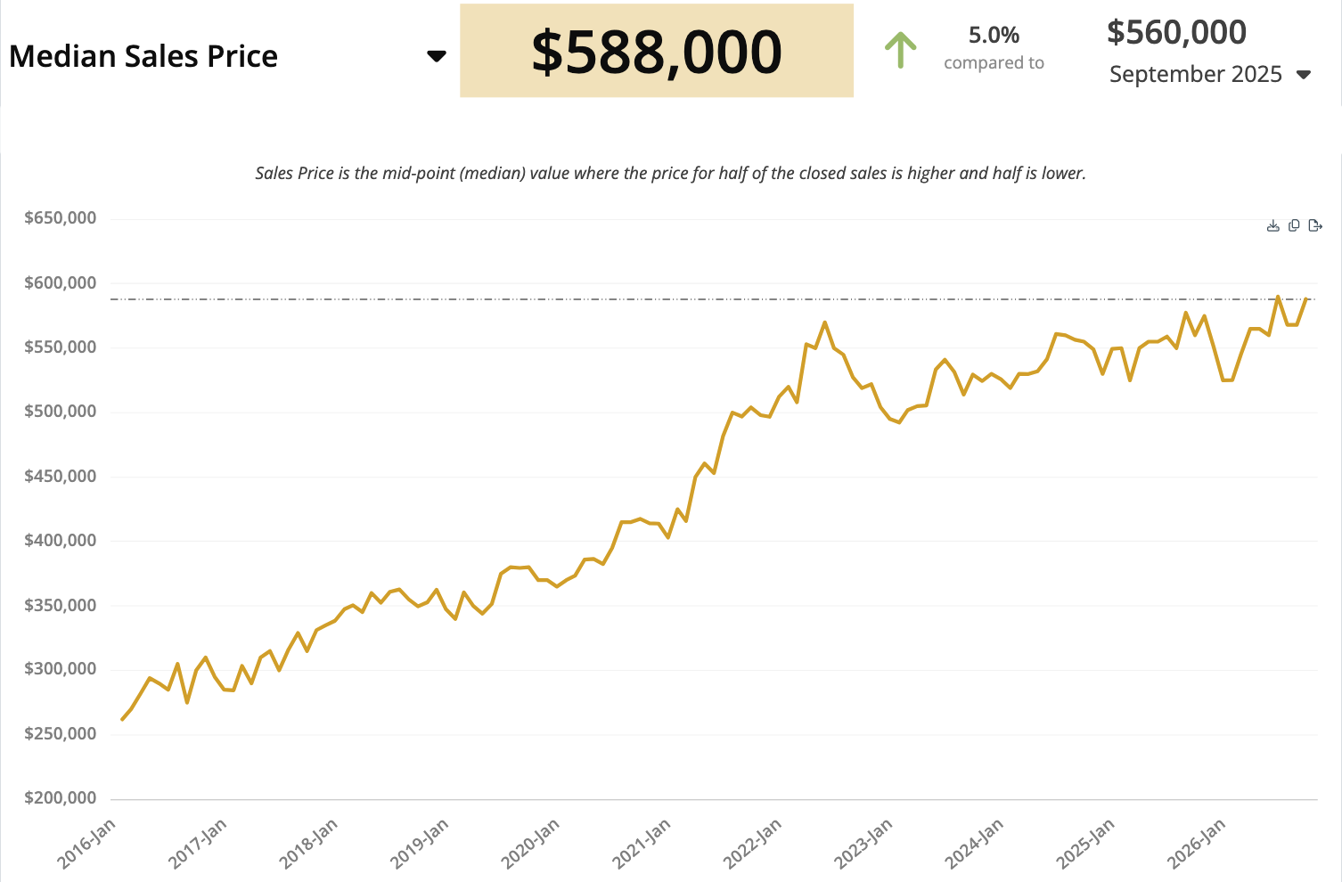
Sparks Single-Family Homes: A $588,000 Median
For Sparks single-family residential properties, the median is $588,000. That is up 5.0% from $560,000 in September 2025.
Reno and Sparks are not moving identically. The separate charts help explain why a metro-wide price headline is only a starting point for a conversation about your own property or search.
Estimated Mortgage Payments Are Higher
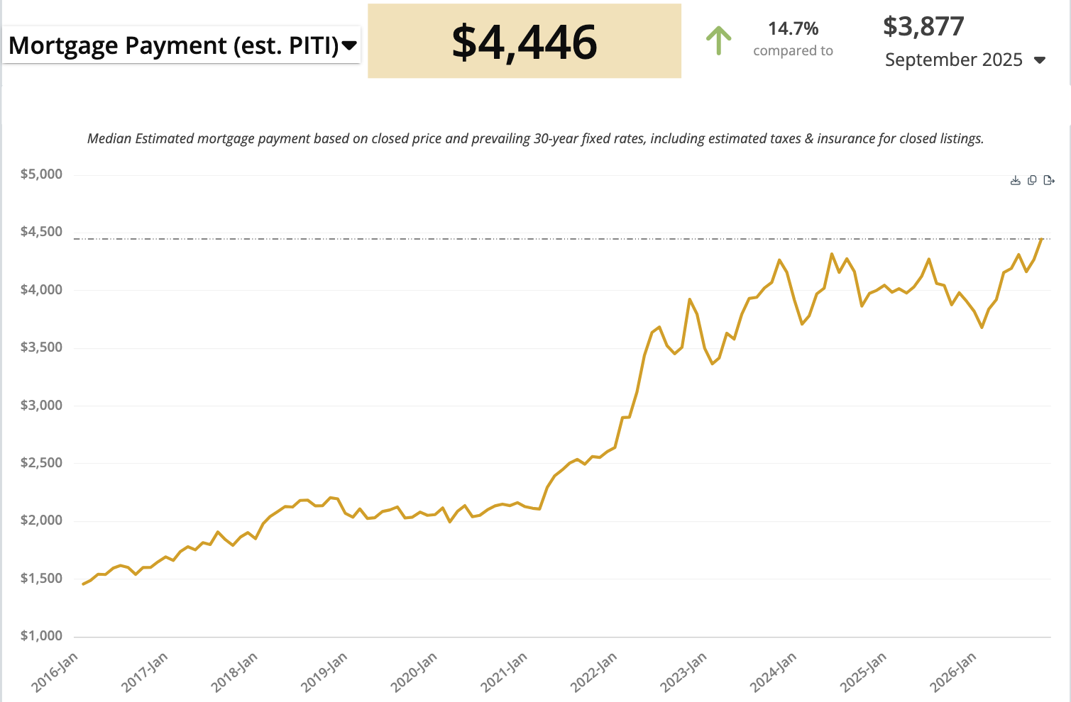
When you put home prices and interest rates together, you can see the pressure on monthly payments. The chart shows $4,446, up 14.7% from $3,877 a year earlier. Both the higher price level and higher interest rate contribute to that increase. For affordability, that is moving in the wrong direction.
Written clarification: The video calls this an “average mortgage payment.” The supplied chart actually labels it a median estimated mortgage payment, including principal, interest, estimated taxes, and insurance (PITI), based on closed prices and prevailing 30-year fixed rates. It is not a survey of everyone’s actual payment or a personalized financing quote. A buyer’s down payment, loan terms, taxes, insurance, and other costs can change the result.
Affordability: An Index of 58, Not “58% of a Home”
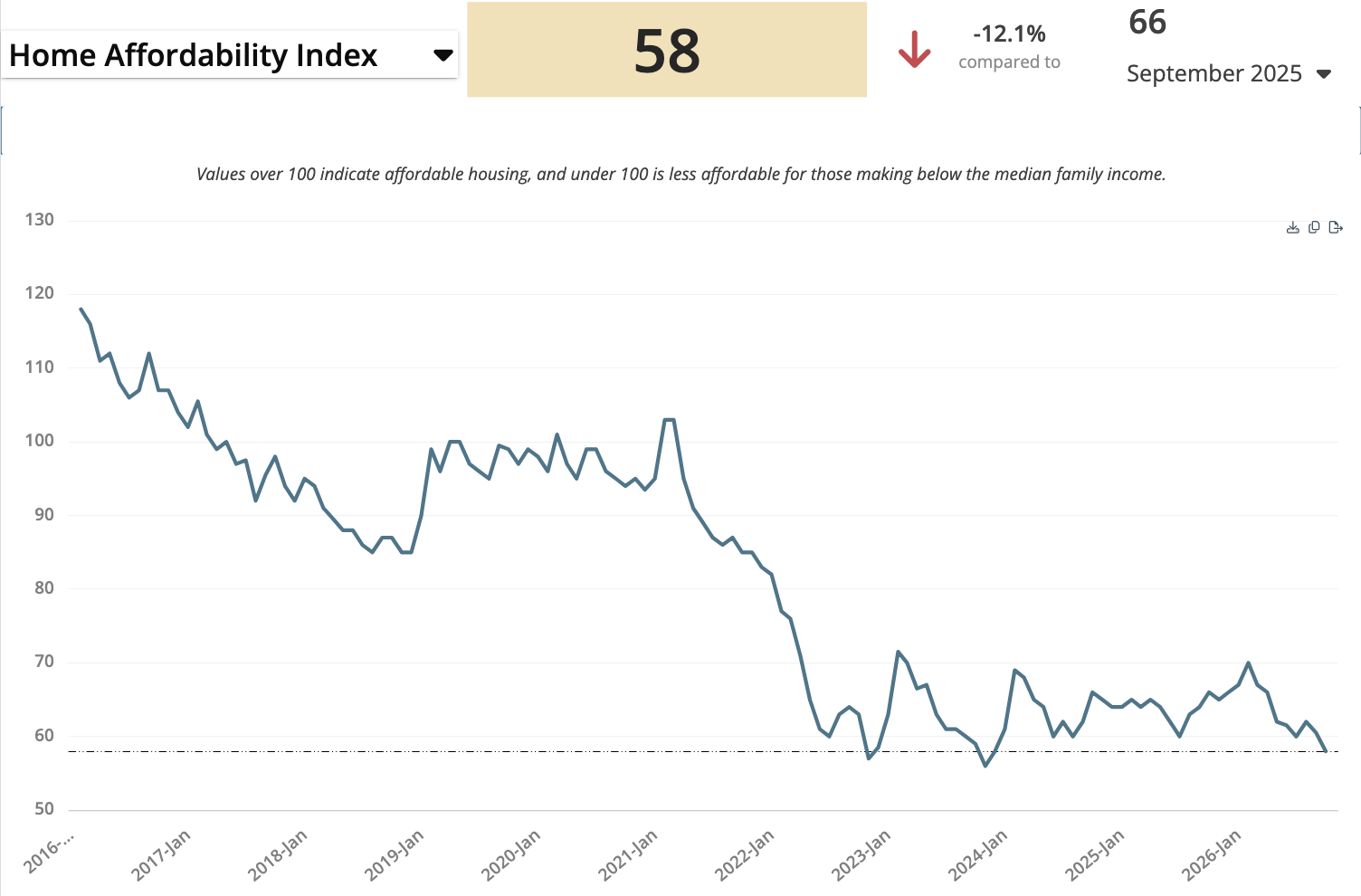
All of this feeds into the Home Affordability Index. The September reading is 58, compared with 66 a year earlier, a decline of 12.1%. This is one of the charts we want to see move up, not down. A higher reading would be better news for buyers.
Written clarification to the narration: The index is not the percentage of a median-priced home that someone can buy. Domus Analytics defines the Home Affordability Index as a measure of whether a typical family earns enough to qualify for a mortgage on a typical home, based on interest rates, median income, and median home prices. Higher numbers mean greater affordability. The supplied chart uses 100 as its affordability reference level; 58 is well below that level. It should not be read as “58% of the home is affordable,” or as the percentage of households that can buy.
The point of the video’s discussion is that affordability remains strained. Moving toward higher readings would be an improvement, but even 80 or 90 would still be below the chart’s 100 reference level.
New Listings: Almost Unchanged From Last September
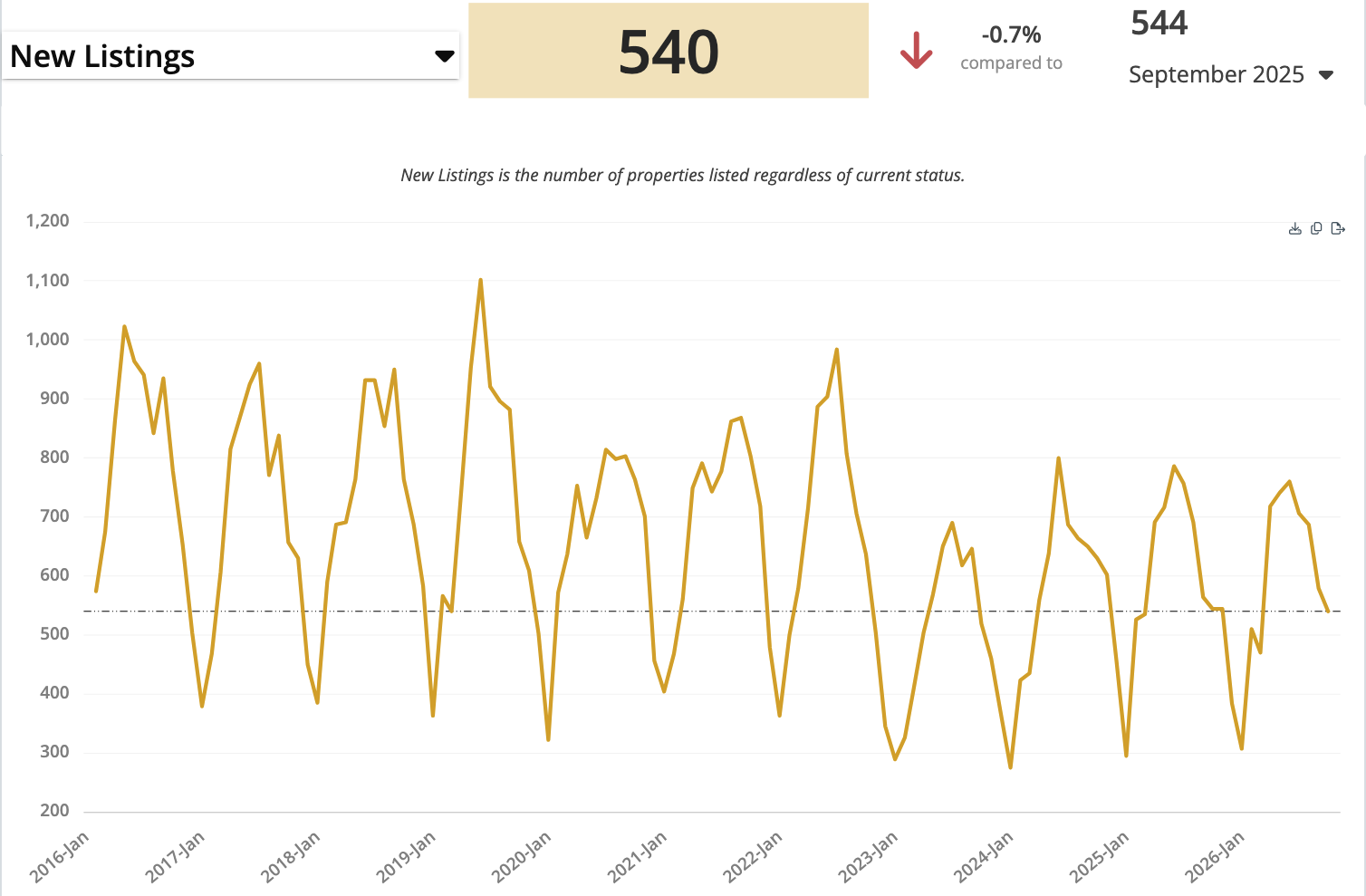
Let’s move from prices and financing to the number of homes coming onto the market. New listings represent owners who raised their hands, called a real estate agent, and decided to list during September.
There were 540 new listings, compared with 544 in September 2025. That is down 0.7%—essentially flat.
Where the New Listings Are Priced
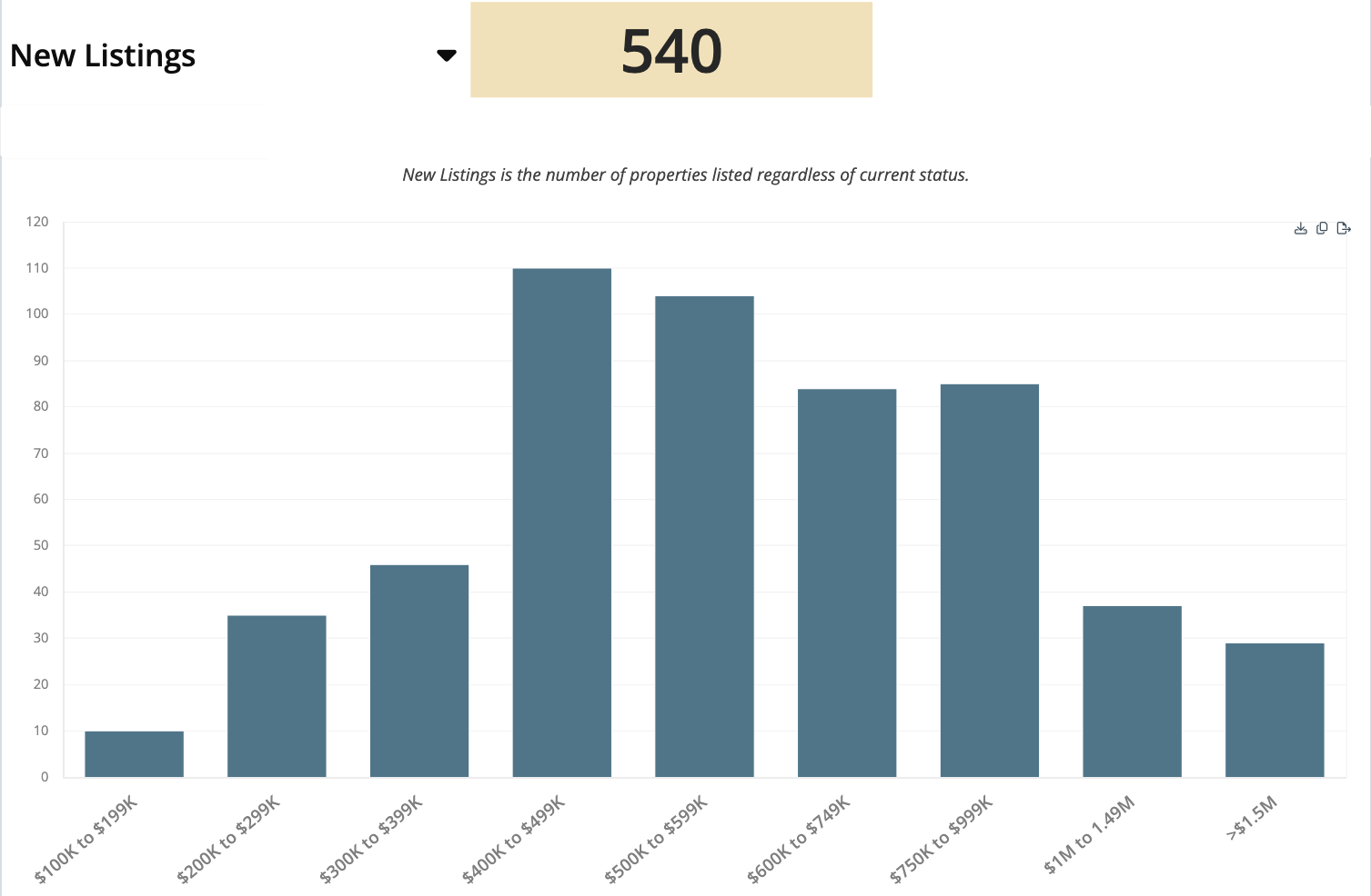
The next chart breaks those September new listings into price ranges rather than showing the decade-long trend. Read across the bands from the lower prices through the upper end.
Much of the new supply is concentrated between roughly $400,000 and $750,000, with the $400,000–$499,999 and $500,000–$599,999 bands especially prominent. The breakdown helps buyers see where homes are being added and sellers see where new competition is arriving.
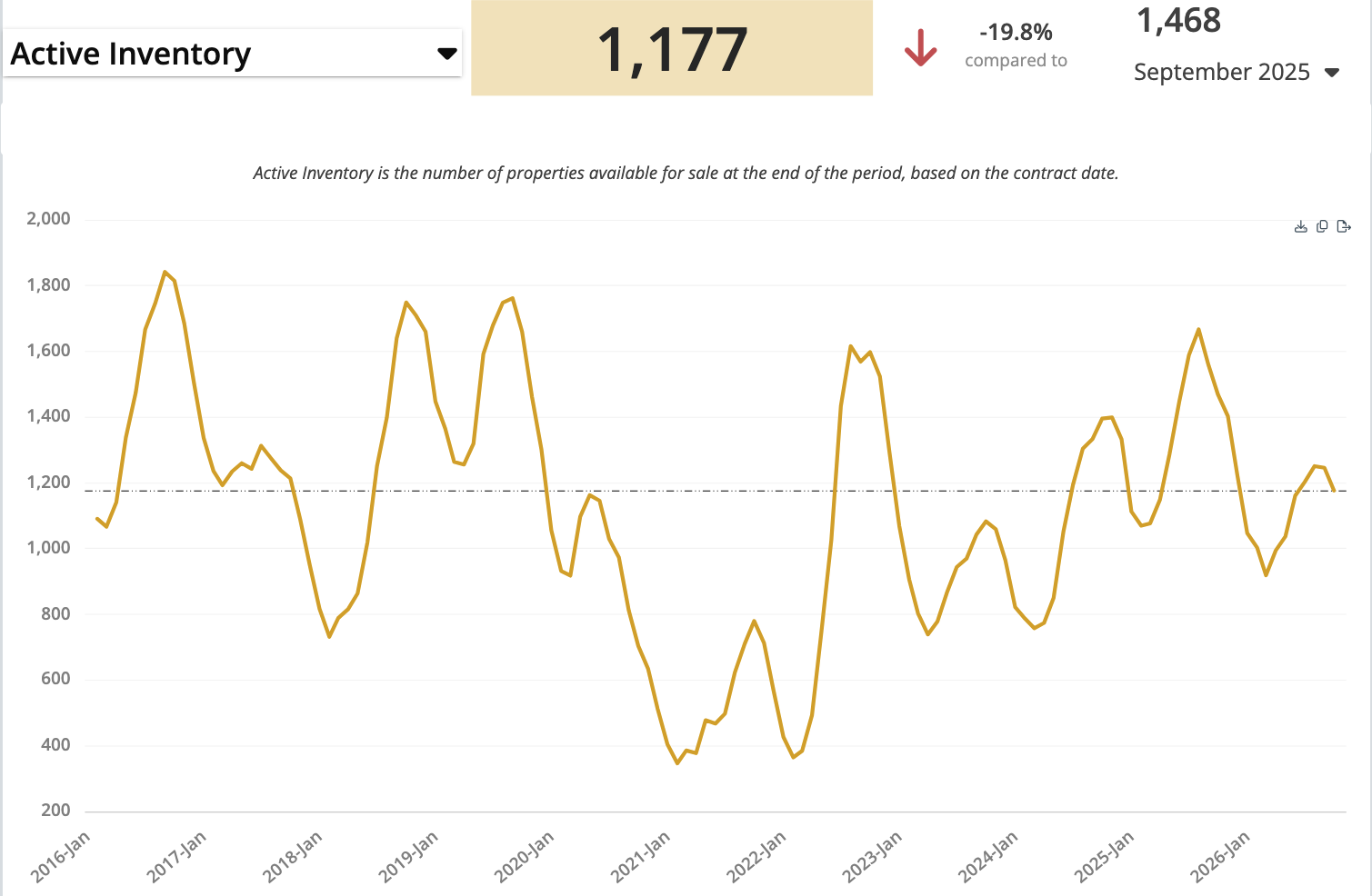
Active Inventory: 1,177 Homes
Active inventory is different from new listings. A home newly listed in September is counted among September’s new listings. A home still active at the end of September might have been listed in July, August, or even May.
The active total is 1,177, down from 1,468 a year ago—a decline of 19.8%. That is a significant reduction in available inventory overall, but it does not mean every price range has the same shortage.
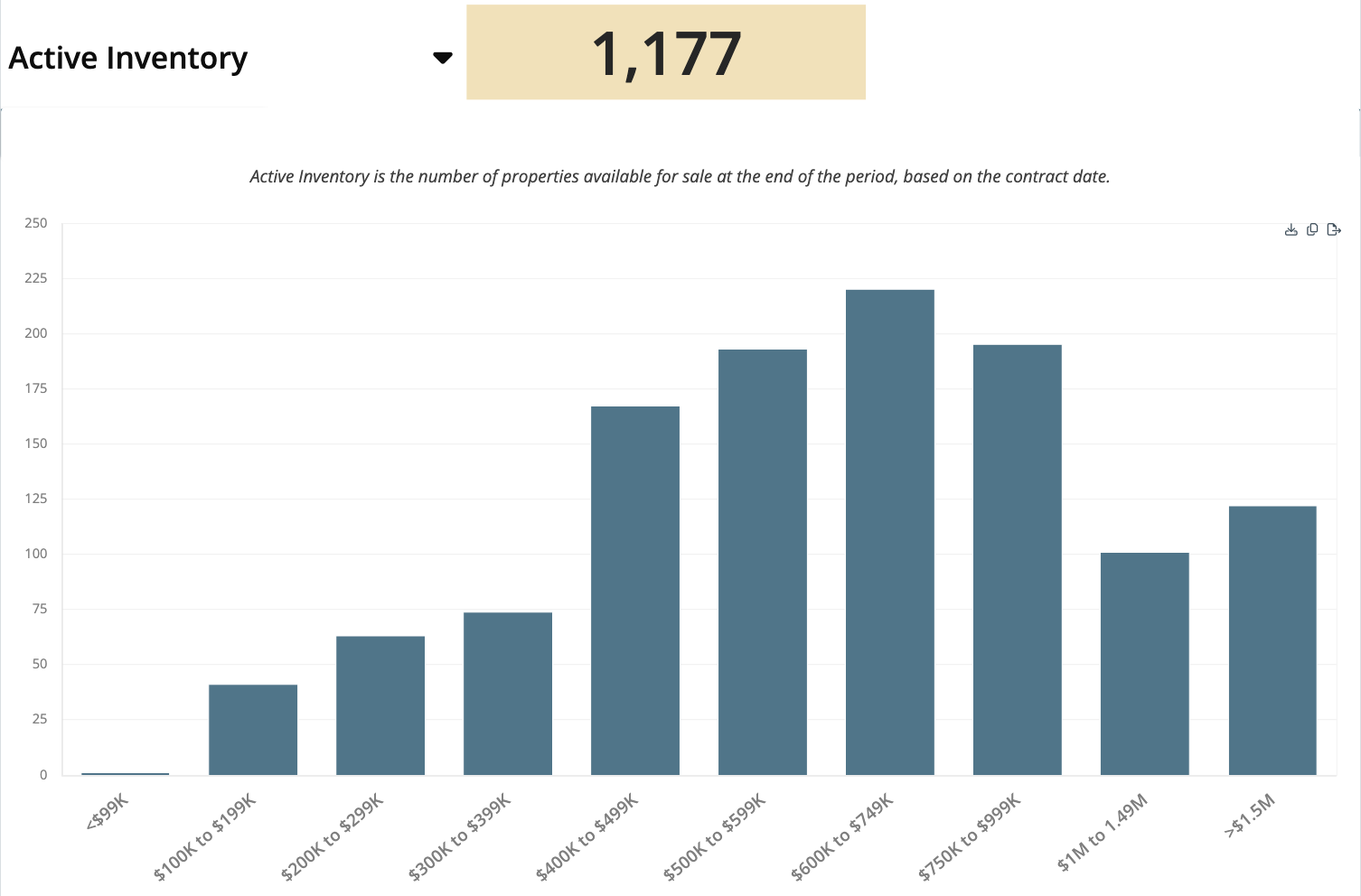
Active Listings by Price: More Competition Toward the Upper End
The active-by-price chart shows substantial inventory in the $600,000–$749,999 and $750,000–$999,999 ranges. There is more choice here than in many of the lower price bands.
Keep this chart in mind as we look at closed sales. The important question is not just how many homes are available, but how that supply compares with the number of buyers actually closing in each range.
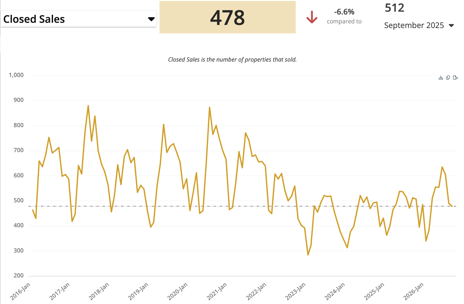
Closed Sales: 478 in September
Closed sales are homes that actually sold during the month. September recorded 478 closings, down 6.6% from 512 in September 2025.
That is a different measure from the active inventory snapshot or the count of new listings. Looking at all three gives us a better picture of supply and activity than any single total can provide.
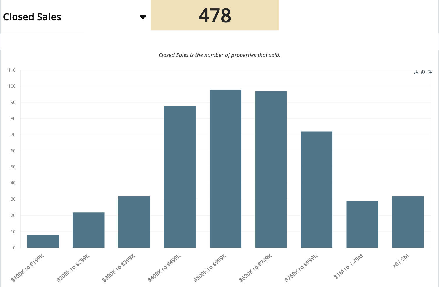
Closed Sales by Price: Where Negotiating Room May Open Up
The largest concentrations of closings are in the $500,000–$599,999 and $600,000–$749,999 bands, with quite a few sales in the $400,000–$499,999 range as well.
Now compare the upper-price bands here with the active-inventory chart. There are quite a few homes available at the upper end, but fewer closings. That can put pressure on asking prices: buyers have more to choose from, can negotiate more, and sellers may need to reduce prices to compete.
This is a comparison of the supplied inventory and monthly-sales charts, not a guarantee that a particular buyer will obtain a discount or that a particular seller must cut their price.
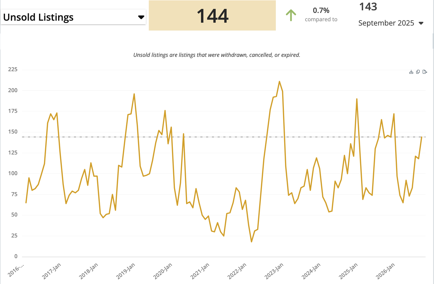
Unsold Listings: A Signal Worth Watching
The last chart is one I think of as a “canary in the coal mine”—something to watch for clues about what may come next. Unsold listings are properties that went on the market but were withdrawn, canceled, or expired without selling.
There were 144 unsold listings in September, versus 143 a year earlier. The chart shows a 0.7% increase, which is essentially flat.
When prices are higher and supply is limited, you might expect fewer listings to go unsold. This is not an enormous number, but it is worth watching. One possible explanation is that some sellers are asking more than buyers will pay and choosing to move on rather than accept less. The total alone does not tell us why each individual listing failed to sell.
What This Means if You Are Selling
It is a tale of two price ranges. Lower-priced homes tend to face tighter supply and less negotiating room for buyers. In the video, I describe that general dividing area as roughly $550,000 to $600,000—not a hard cutoff that applies to every neighborhood or home.
As you move higher in price, inventory becomes more plentiful relative to sales, and competition matters more. If you are listing in those upper ranges, be especially sensitive to price. Start competitively rather than assuming the overall median increase means buyers will accept any asking price.
If your home is not moving in the first two, three, or four weeks, reassess the pricing and your competition. A price reduction may be needed to become more competitive. The right decision depends on the property and the response to the listing, rather than a blanket rule for every seller.
What This Means if You Are Buying
The same pattern works in reverse for buyers. At the lower end, there may be less room to negotiate because choices are more limited. As you move into higher ranges—roughly $600,000 to $650,000 and above in the discussion—you may have more homes to compare, more opportunity to be selective, and more room to negotiate.
These are broad observations from the charts, not exact boundaries. Look at the competing homes in your actual search area, their condition, and how long they have been available. Affordability and the monthly payment still need to work for you.
Talk Through Your Next Move
Whether you need to buy or sell, take a look at Assist2Sell. Our team helps sellers compare their options and helps buyers explore homes available in the area. There can be good opportunities, but the strategy should fit your situation.
Listing-fee clarification: Assist2Sell Buyers & Sellers Realty offers full-service representation with a 1.5% listing fee. Buyer-broker compensation, if any, is separate and negotiable. Real estate fees are negotiable; terms and actual savings vary. The listing fee should not be mistaken for the total of all transaction costs.
Call, email, or text—whichever works best for you. You can reach us at 4RenoHomes.com, call or text 775-688-6060, or email info@4renohomes.com. Thanks for watching, and we will see you next month for the Reno-Sparks real estate market update.
Data note: The market figures and original slides in this article are from the supplied October 2026 video package and describe September 2026, with year-over-year comparisons to September 2025. This article is not a new MLS audit. Statistics may be revised, mortgage rates and market conditions can change, and historical results do not predict future outcomes.